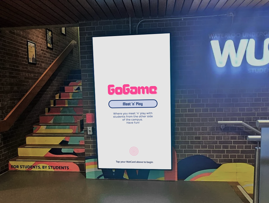
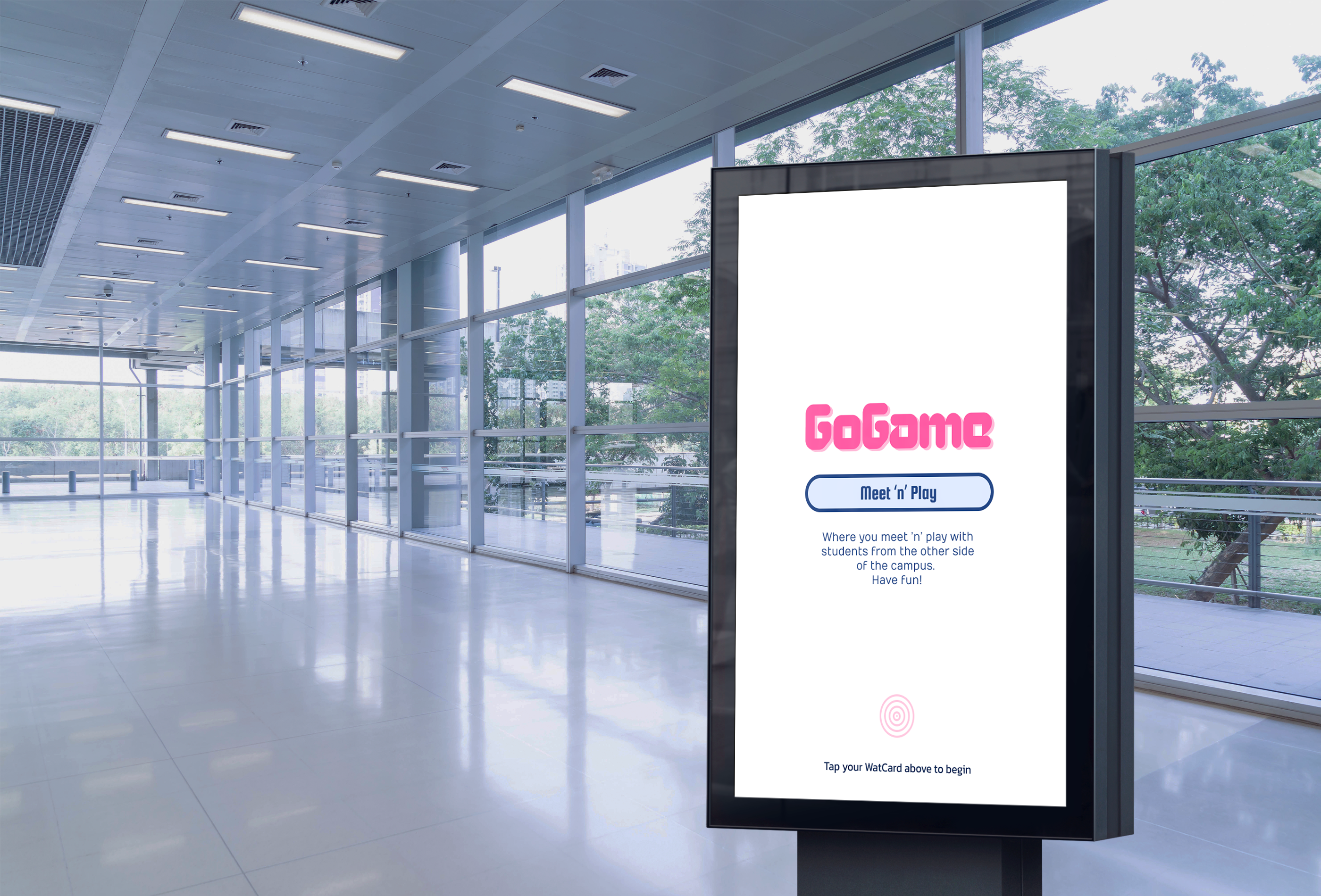
GoGame
Conceptual · Hybrid
Course Project
Roles
UX Researcher
UI/UX Designer
Timeline
4 weeks
Nov 2023
Tools
Figma
Team of 4
(overlapping roles)
4 UX Researchers
4 UI/UX Designers
Deliverables
UI Style Guide
Low-Fidelity Digital & Paper Prototypes
High-Fidelity Digital Prototype
Research Report
30s Advertisement Reel
3 Presentations (Proposal, LF, HF)
Role
UX Researcher
UI/UX Designer
Timeline
4 weeks
Nov 2023
Tools
Figma
Team of 4
(overlapping roles)
4 UX Researchers
4 UI/UX Designers
OutPut
UI Style Guide
Low-Fidelity Digital & Paper Prototypes
High-Fidelity Digital Prototype
Research Report
30s Advertisement Reel
3 Presentations (Proposal, LF, HF)
Executive Summary
GoGame is an interactive on-campus gaming system that helps international students relieve stress and connect with peers through short, spontaneous gameplay. Developed through three design iterations and multi-method user research, the project achieved a System Usability Score of 97.5, demonstrating exceptional ease of use and strong emotional engagement.
Through persona walkthroughs, think-aloud studies, and SUS surveys, we discovered that users valued quick, casual interactions, intuitive controls, and safety verification. These insights led to the integration of WatCard (student ID) authentication, live video chat, and a streamlined linear flow, creating a more secure, inclusive, and fun way to meet people on campus.
Takeaways
GoGame taught me how interface design and physical interaction can merge to address real human needs: blending accessibility, mental wellness, and social UX.
Working through iterative testing, persona validation, and usability scoring deepened my ability to synthesize data into actionable design decisions while balancing emotional and functional aspects of experience design.
Overview
A fun break on-the-go to meet & play with students on campus
GoGame is an interactive public installation designed to help international students build positive coping strategies and ease social isolation through spontaneous, playful interactions.
By using screen-based connected gaming stations installed in high-traffic campus areas, students can meet peers, compete in short games, and take fun breaks between classes, supporting both mental well-being and social belonging.
Problem
How might we design a safe, playful public space that makes social connection easier, more natural, and more enjoyable for international students?
International students often struggle with loneliness, limited free time, and social anxiety when trying to make friends in a new environment. Traditional social events are time-consuming or intimidating, leaving little room for spontaneous connection.
Solution
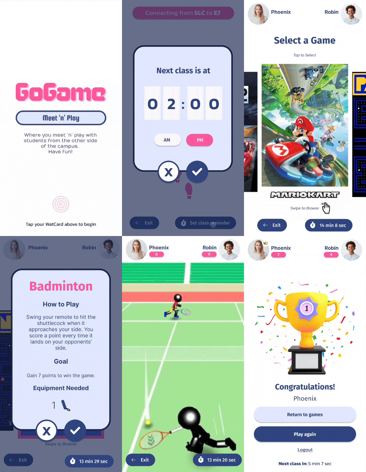
GoGame connects two students located at different on-campus gaming kiosks, enabling them to:
- Instantly match and play casual games like bowling or tennis
- Chat through live video during gameplay
- Take short, fun breaks between classes without the stress of planning
We aimed to design an experience that was:
- Quick and casual
- Safe and inclusive
- Encouraging of meaningful interaction through play
Students log in securely using their student ID, ensuring safety, authentic connections, and personalized experiences.
Research
96% of international students aged under 40 years reported loneliness (Kangning Zheng et al., 2023)
Study Objectives
We aimed to understand:
- How international students perceive spontaneous play as a social connector
- What barriers prevent them from engaging with public interactive systems
- How to design a system that feels both safe and inviting
Research Methods
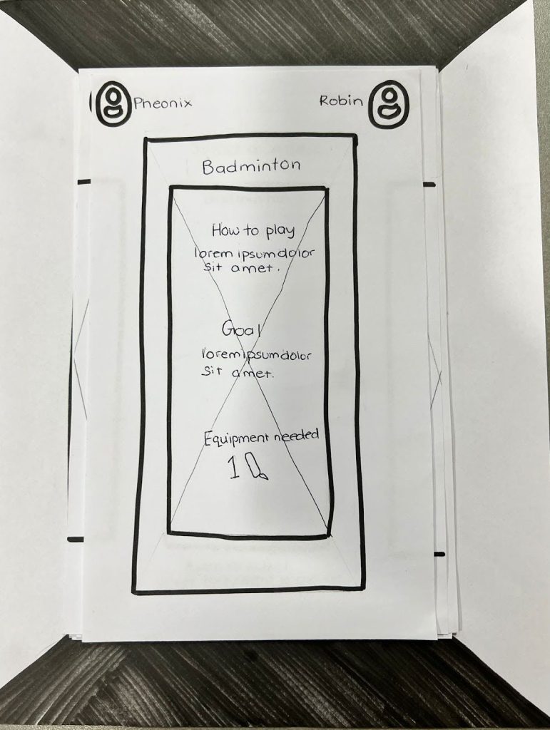
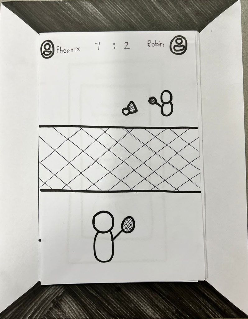
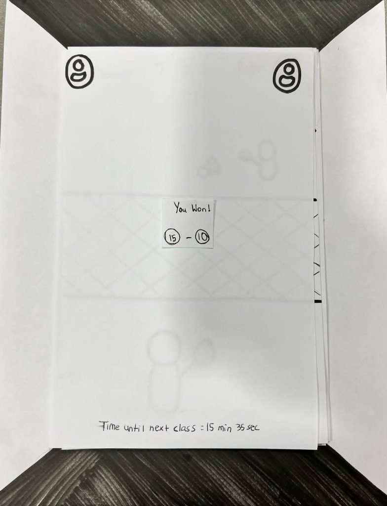
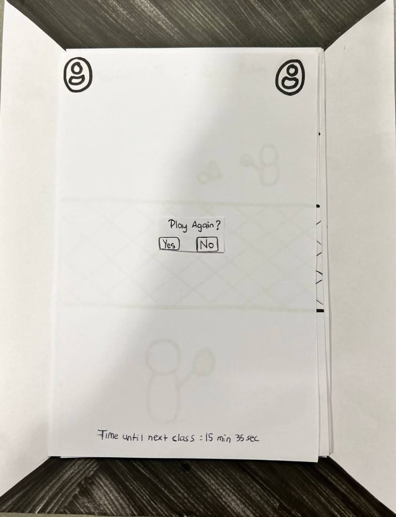
Persona Walkthrough
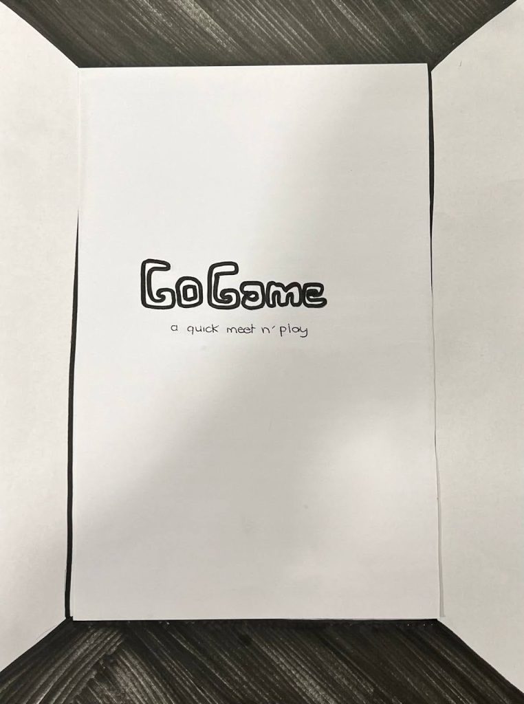
Paper Prototype | 4 participants
To identify social comfort zones, needs, and safety concerns through role-play
Think-Aloud Usability Test
LF & HF Prototype | 8 participants
To observe live user behavior and navigation challenges
Post-Test Interview
LF & HF Prototype | 8 participants
To gather qualitative feedback and emotional reactions
System Usability Scale (SUS)
LF & HF Prototype | 8 participants
To quantify usability satisfaction and improvement
Affinity Mapping
All Stages
To cluster and analyze qualitative findings into navigation/instruction, preferred features, user control, design, overall UX, and suggestions to direct design actions
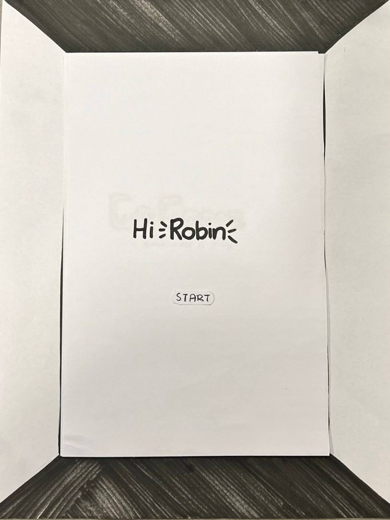
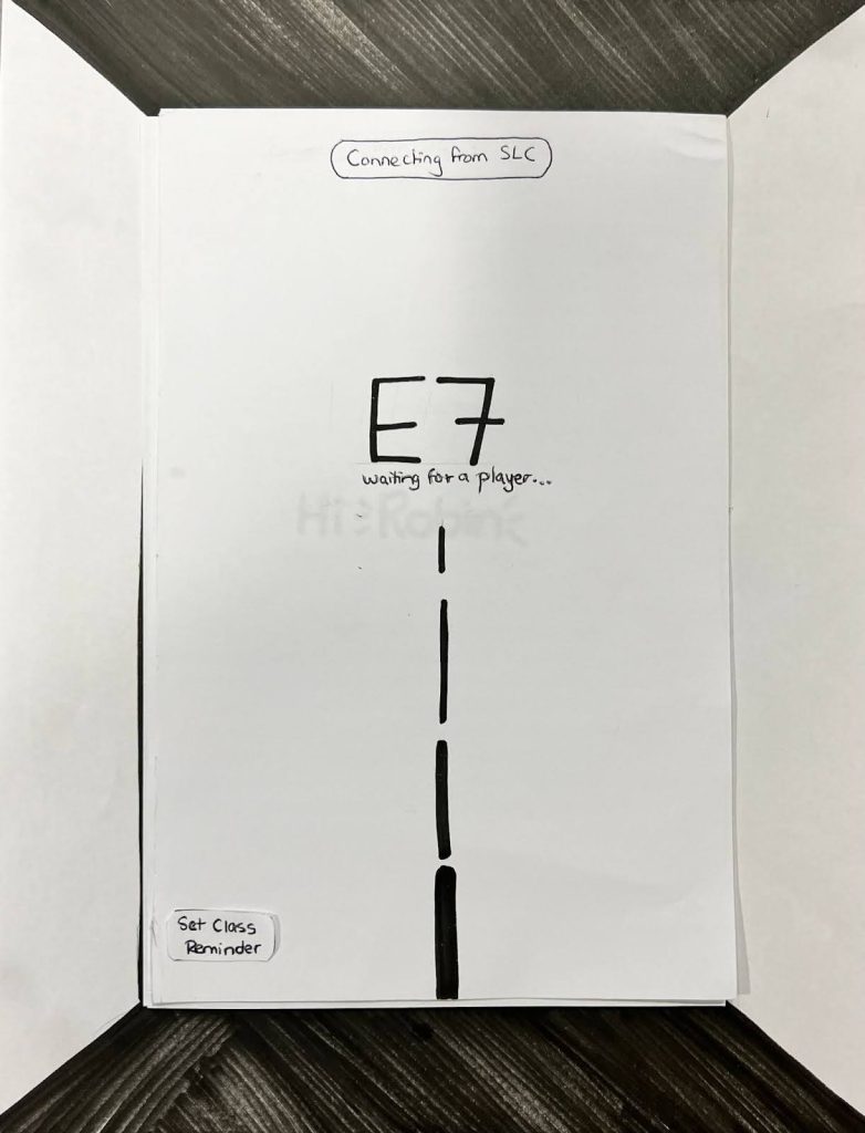
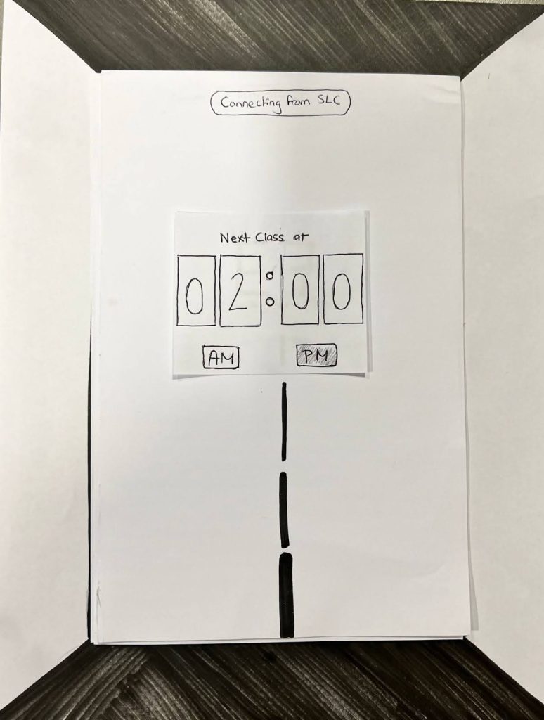
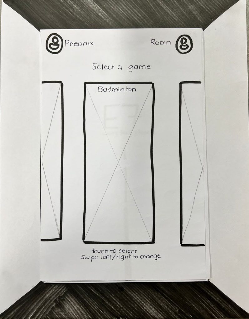
Paper Prototype User Persona Walkthrough
- Alex (Mechanical Engineering, 2nd Year):
Likes quick, convenient connections. Felt that mandatory icebreakers wasted time and reduced gameplay enjoyment. - Vishal (BBA + CS Minor, 4th Year):
Wanted deeper, more social interaction; wished the system felt more face-to-face. - Marisa (Math, 1st Year):
Anxious about meeting strangers; preferred jumping straight into games instead of forced introductions. - Aisha (Life Sciences, 2nd Year):
Loved the idea and location; emphasized need for safety measures and clear identity verification.
Walkthrough Affinity Analysis
- ✅ Students appreciated convenient locations and quick access
- ✅ Valued “fun breaks” during study or work hours
- ⚠️ Wanted improved safety verification for opponents
- ⚠️ Preferred to skip icebreaker games and jump straight to gameplay
- ⚠️ Desired more natural, video-based social interaction
- ⚠️ Some felt self-conscious using public-facing screens
Low-Fidelity Digital Prototype Testing
Goals: Validate initial interaction flow and interface clarity
Key Positive Findings
- Intuitive screen navigation and game selection
- Personalized name features made the experience engaging
- Timer and class reminder feature felt useful
- Self-explanatory interface with clear task flow
Constructive Feedback
- Ending screen lacked interactivity
- Accessibility needs (vision, hearing, dyslexia) under-considered
- Initial screens lacked instruction clarity
- Some users confused by 3D visual cues on flat prototypes
- Desired visual and audio feedback expected from “gaming” contexts
- Questioned external device setup (controllers, headset) clarity

High-Fidelity Digital Prototype Testing
Testing Methodology
Participants completed a full end-to-end flow: logging in, connecting, playing a game, and logging out, while thinking aloud. Follow-up interviews captured deeper reactions, while SUS surveys quantified usability progress.
Qualitative Findings (Think-Aloud + Interview)
- Clear menu structure and on-screen guidance improved navigation
- Timer and exit/continue controls gave users strong sense of control
- Visual design felt fun, vibrant, and approachable
- Gameplay was described as “simple, intuitive, and exciting”
Actionable Insights
- Add option to reconnect or exchange contact info after play
- Enlarge camera windows for better visibility and realism
- Strengthen primary call-to-action buttons
- Include tactile props (controllers, headset mockups) for realism

System Usability Scale (SUS) Scores
Our overall score was 97.5, showing great improvement from our last score of 87.5. The improvement validated that design refinements increased clarity, comfort, and overall user delight.
Ideation
Round 1: Concept & Pitch
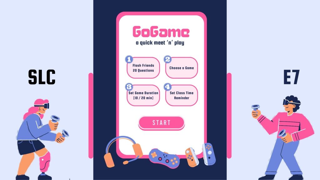
- Two linked kiosks placed in Student Life Centre (SLC) and Engineering 7 (E7)
- Game included Flash Friends (20 Questions) as a social icebreaker before mini-games
- Optional class reminders to avoid missed lectures
Findings: Users loved the idea but felt constrained by mandatory icebreakers.
Round 2: Low-Fidelity Prototype
- Removed the Flash Friends segment
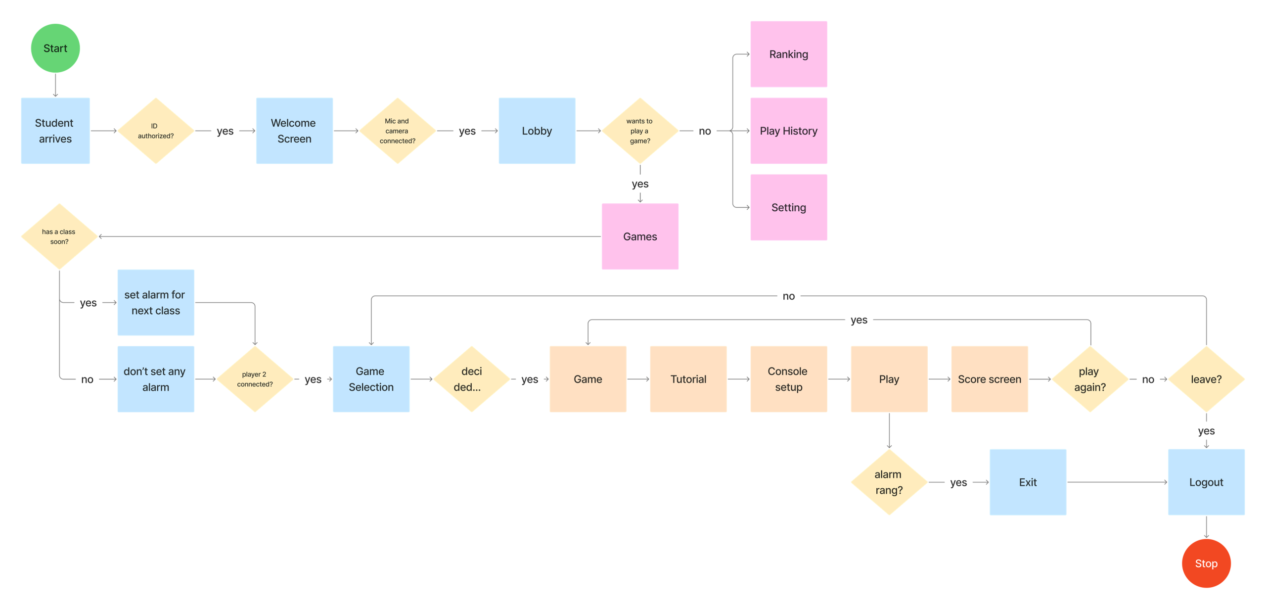
- Streamlined experience into a linear flow
- Simplified onboarding with single screen guidance
Final Design
Round 3: High-Fidelity Prototype
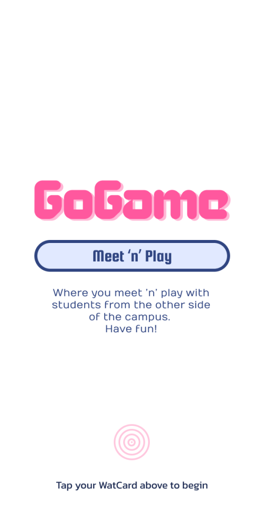
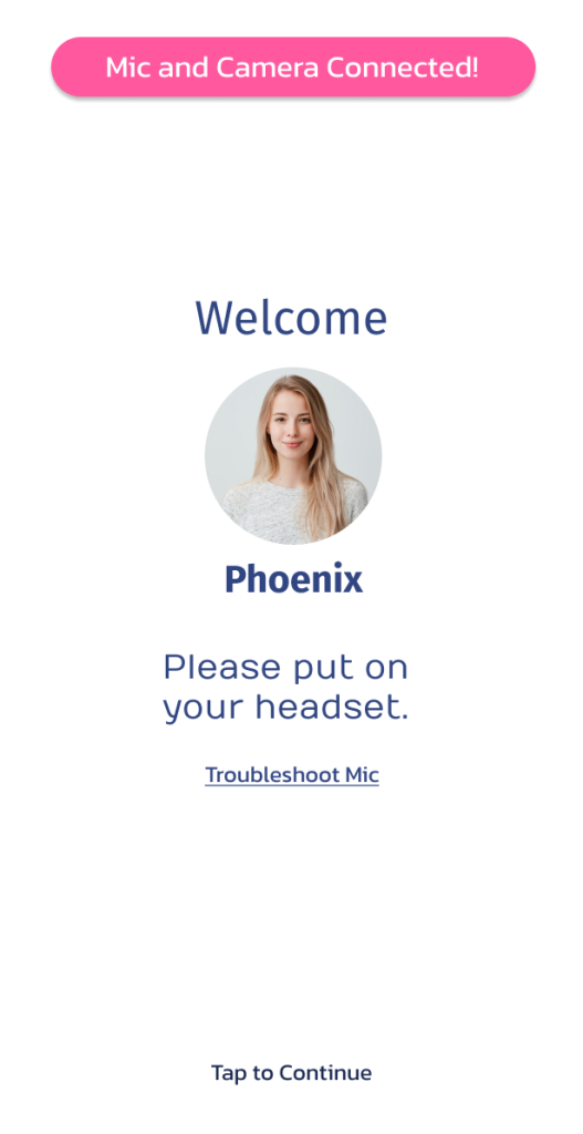
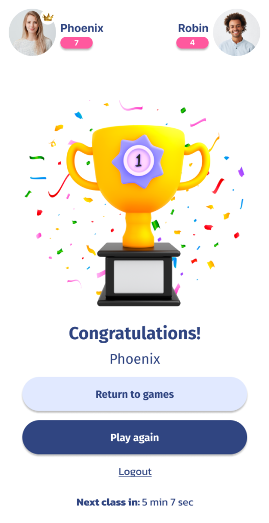
- Added WatCard login for secure authentication and faster access
- Introduced live video chat to increase connection and trust
- Focused gameplay experience (no extra setup distractions)
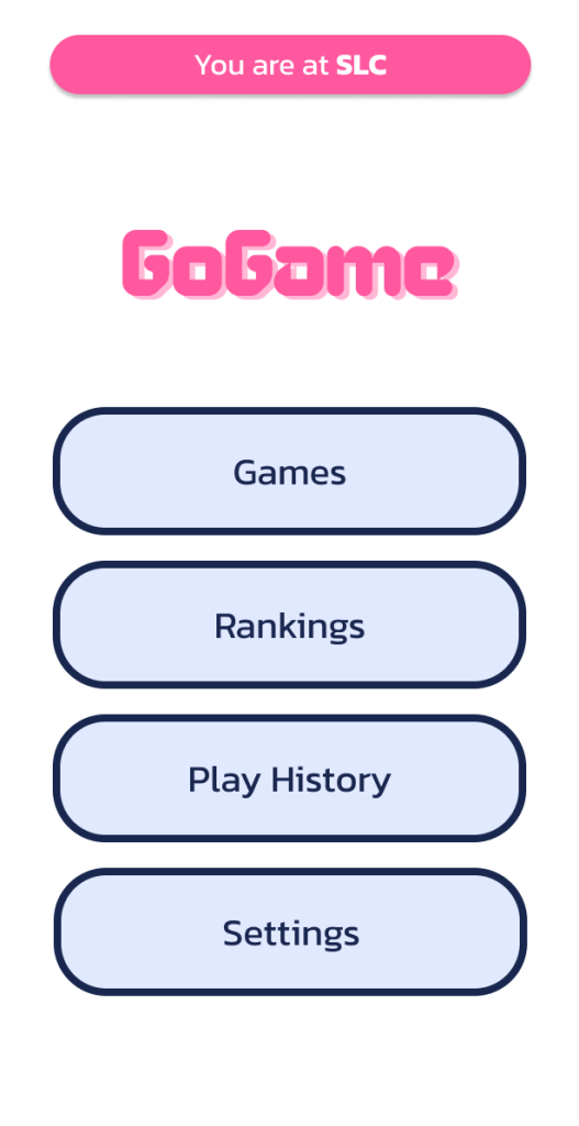
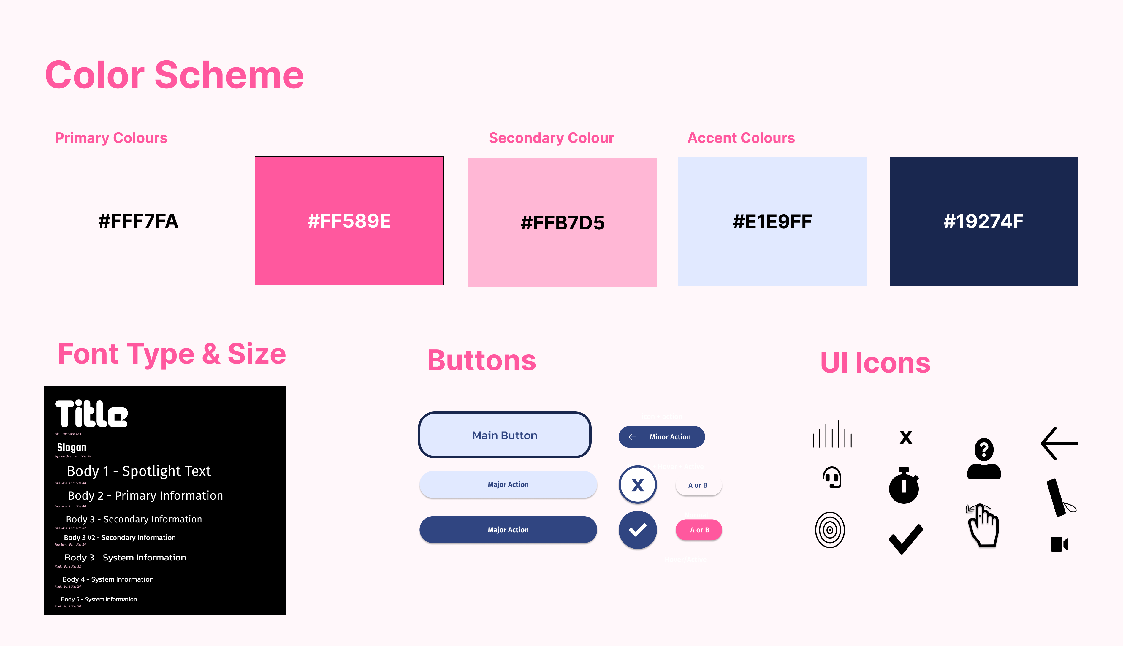
- Clean, arcade-inspired visual design using bold blue and pink hues
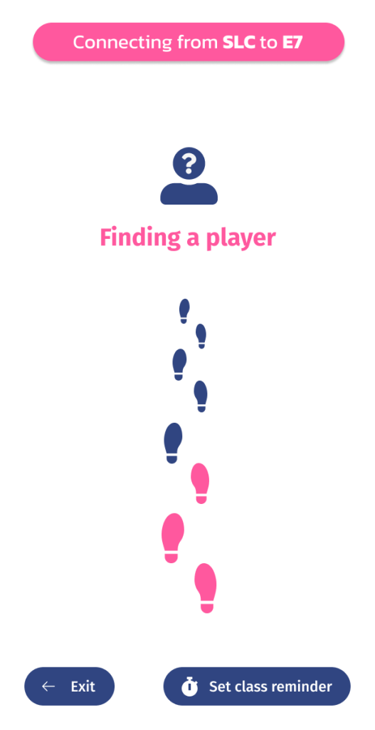
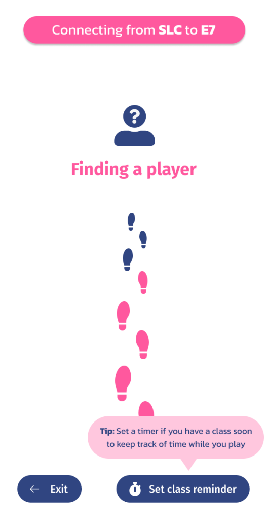
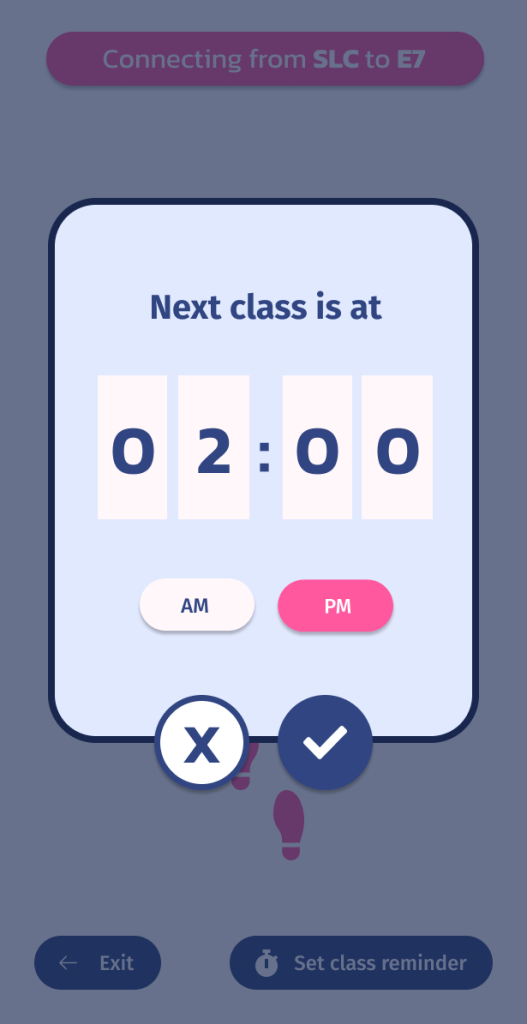
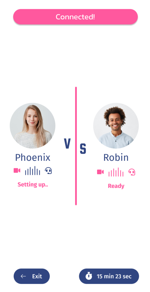
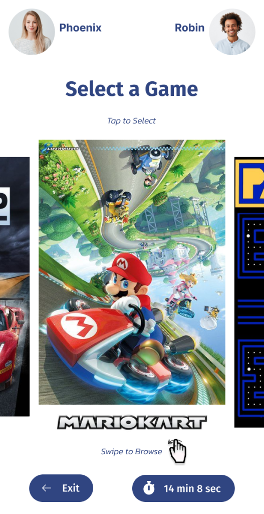
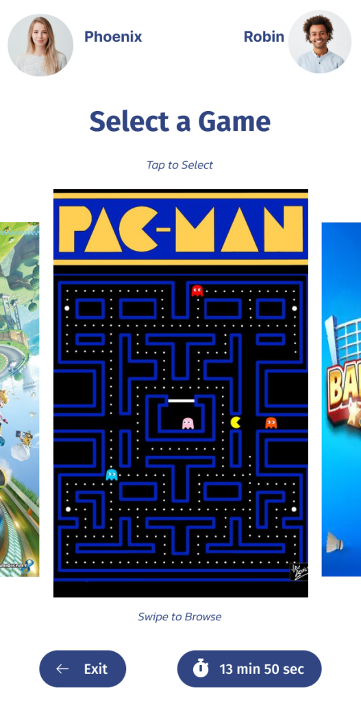
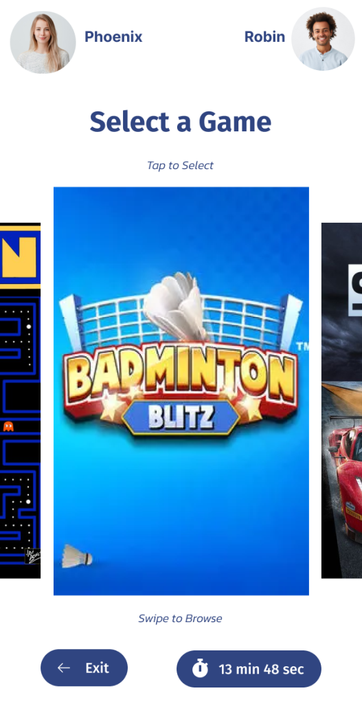
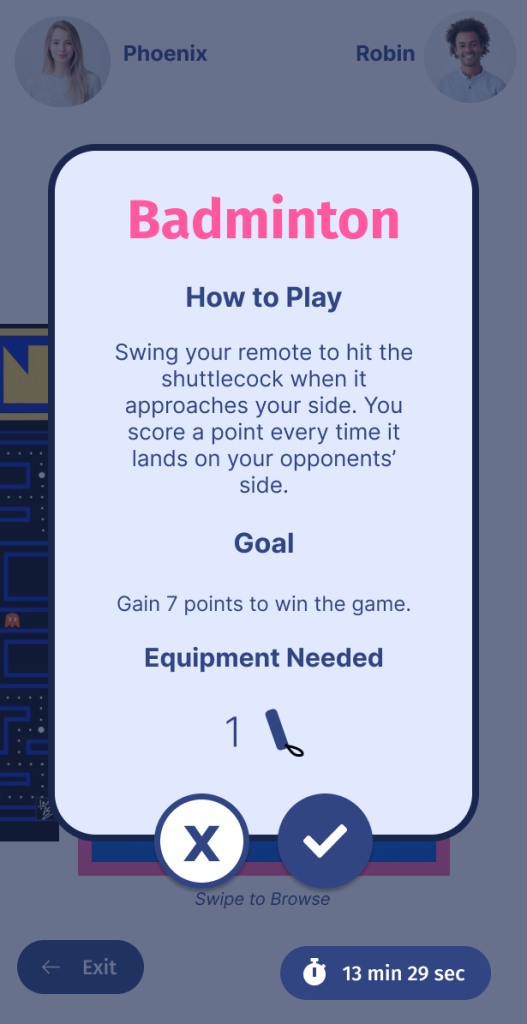
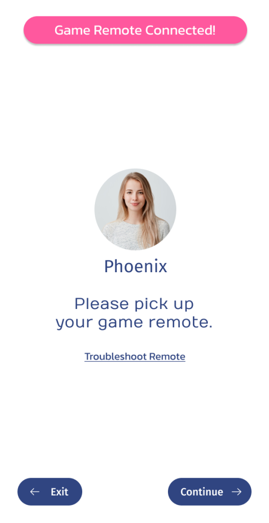
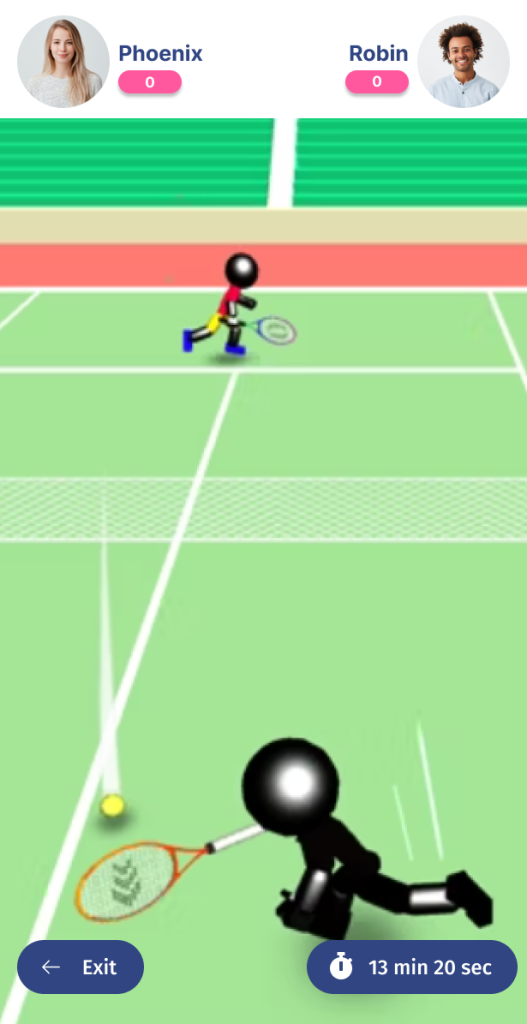
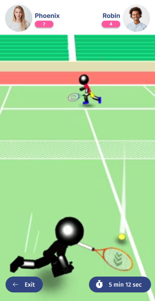
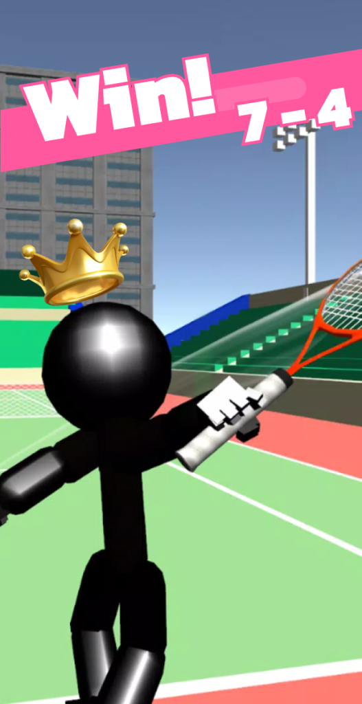
User Flow Diagram
Outcome
- Usability improved by 10 points (SUS 87.5 → 97.5)
- 100% of users completed all core tasks without assistance
- Users reported feeling more relaxed, engaged, and socially comfortable
- Prototype validated as a low-barrier, high-engagement social connector
- Findings informed design guidelines for future public interactive systems focused on mental wellness
Future Opportunities
- Integrate player reconnection and post-play contact options
- Enhance accessibility features for vision and hearing diversity
- Add larger video feeds and optional privacy filters
- Conduct field pilot testing with real kiosk hardware and live campus participants
2 years later:
