The Art Gallery of Ontario is an art museum in Toronto, Ontario, CA. It is one of the largest art museums in North America and second-largest in Toronto after the ROM. The gallery allows visitors of all ages from all around the world to check out their exhibition spaces, events, and programs. There are also artist-in-residence offices and studios, dining facilities, gift shop, innovation labs, library, archives, theatre, lecture hall, and a research center. The museum collection includes thousands of works from Canadian, First Nations, Inuit, African, European, and Oceanic artists.
Challenge
While studying more about user experience and user interface design, I decided to redesign the Art Gallery of Ontario’s website based on issues I identified with:
1) visual input and information overload through extended scrolling
2) redundant sites and redirections
3) not sufficient display of images and artworks and
4) tab hierarchy is too busy and repetitive (i.e., one or more sub tabs lead to the same URL)
I would like to mention that their design was NOT necessarily a bad UI, but I believed that firstly, it does not suit the image of AGO and secondly, a simpler arrangement would help much more for new visitors rather than dumping all the information on main page. This case study does not encompass the entire website, only the most relevant pages to first time visitors.
DISCLAIMER
This is a unsolicited redesign project. I am not affiliated with the AGO or any other gallery. This is a personal case study of UX/UI design and my opinions and suggestions are solely my own and are not reflective of AGO.
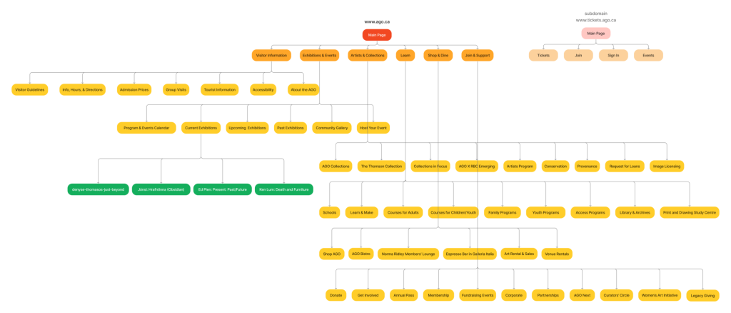
Original Site Map
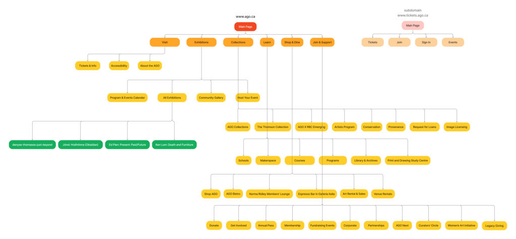
Resdesigned Site Map
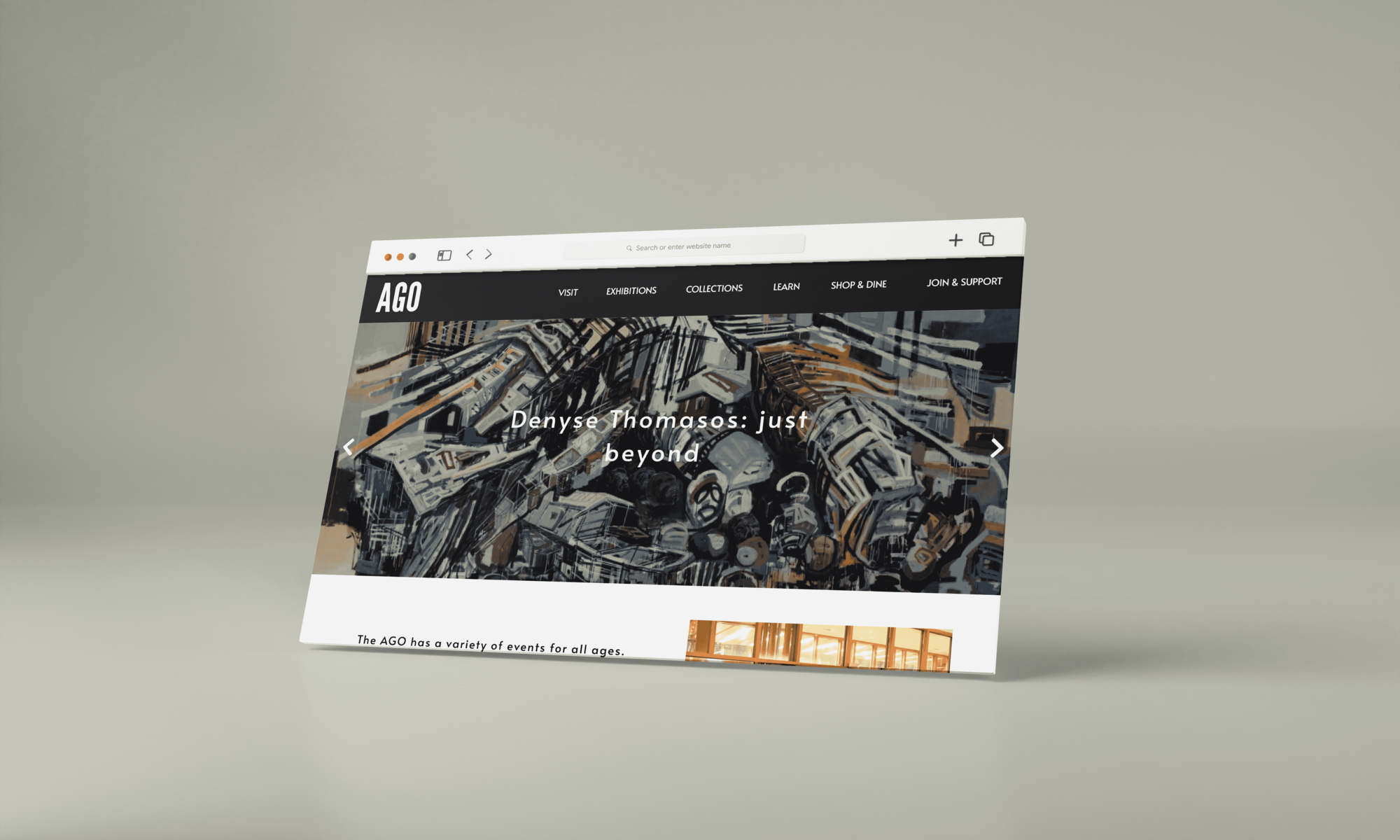
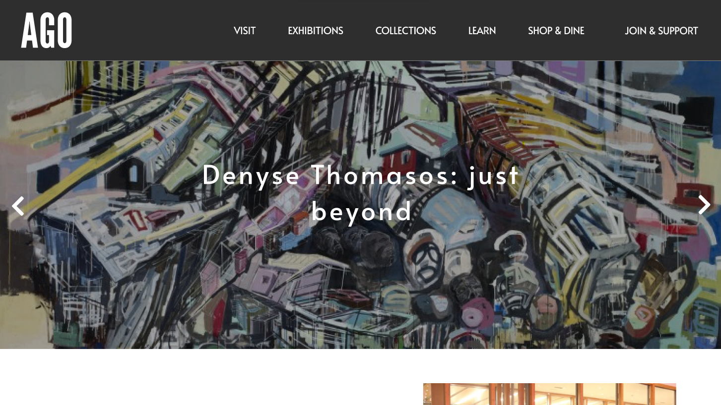
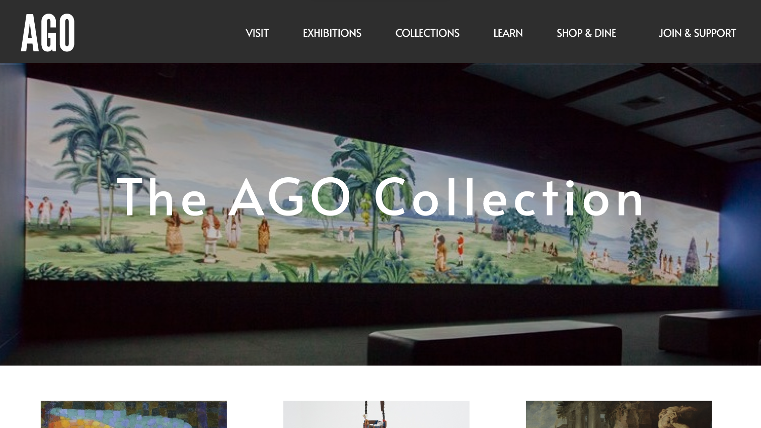
Home Page
For the home page, I decreased most of the information that was there before and gave the spotlight to the carousel of current and upcoming exhibitions. I also highlighted the events and program page as that was not mentioned at the front significantly. I shrunk the news section and put them side by side because as a first-time user I was really confused on what was the difference between both the news, but clearly they are referring to two distinct news sections.
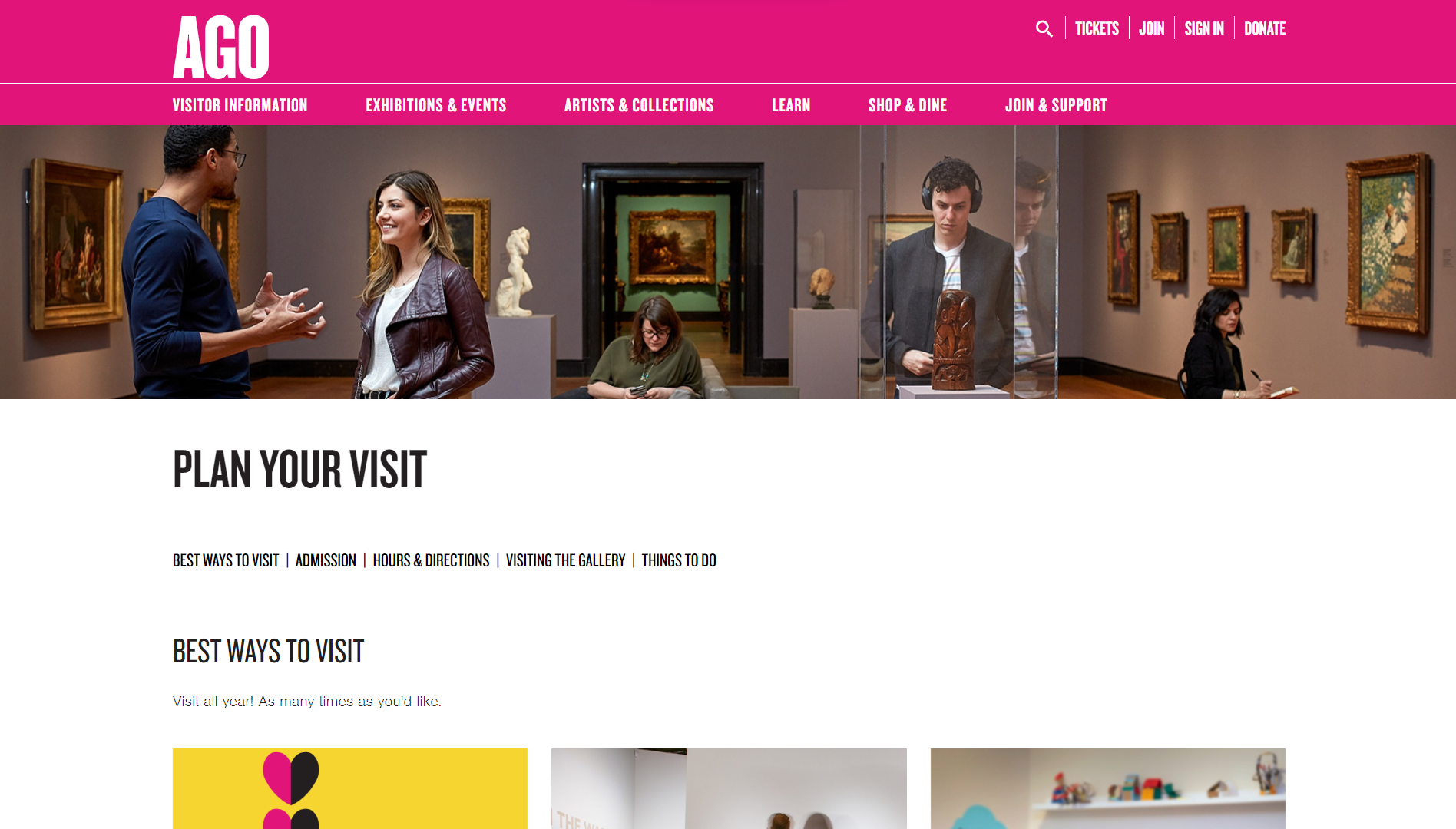
Visit Page
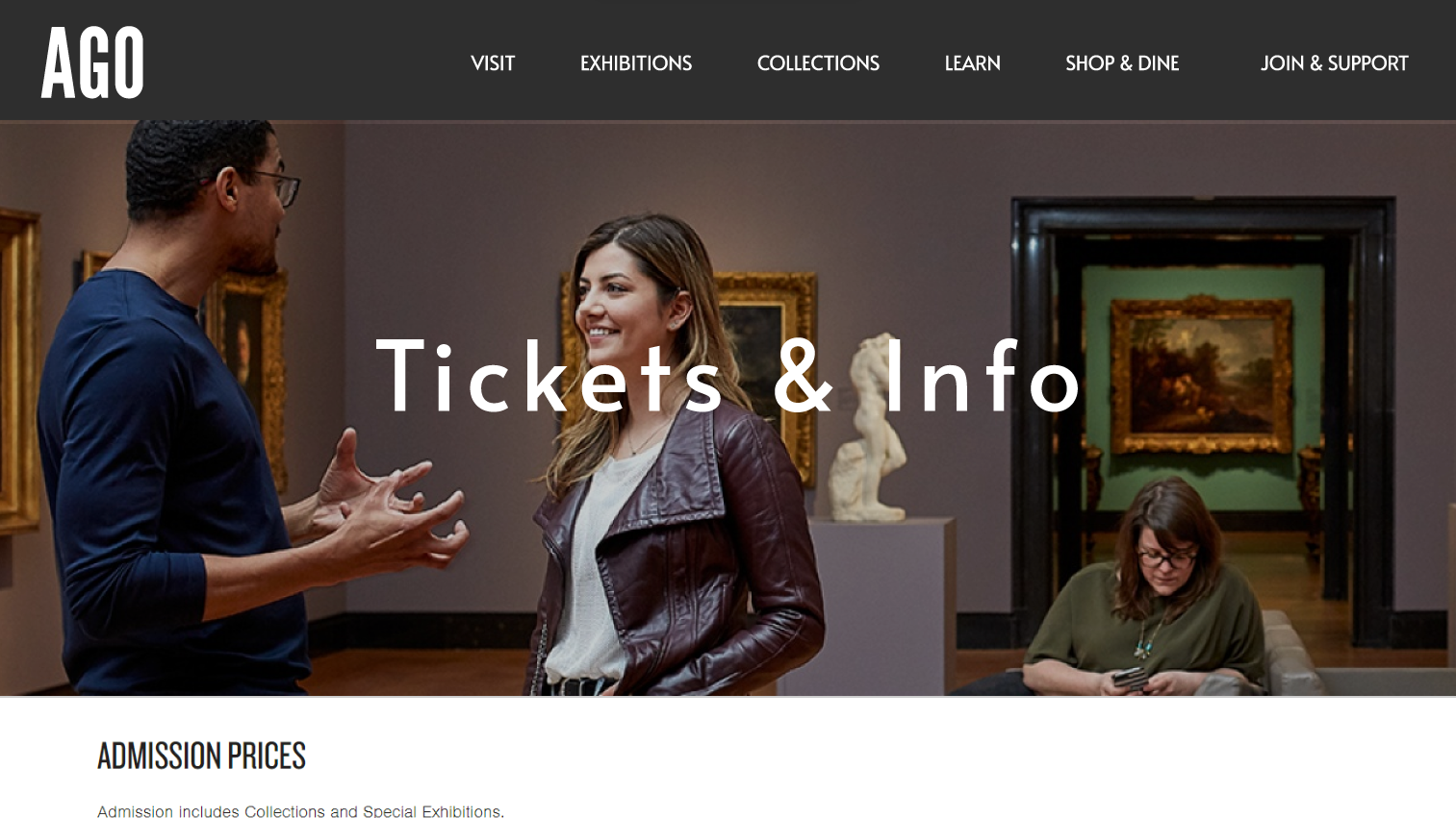
I simplified the visitor information, info, hours, and directions, and a couple more redirections into one page called Tickets and Info. This page would also include the tourists and group booking too. I would definitely prefer to redesign the prototype for the tickets and info page as it does not show as much, I would have liked and it would have taken a few more iterations to reach a good balance of design and readability.
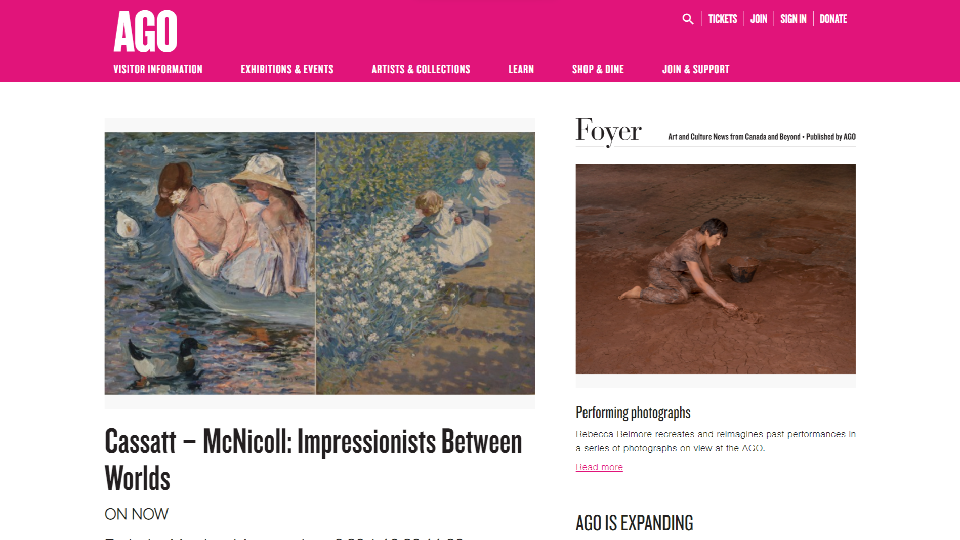
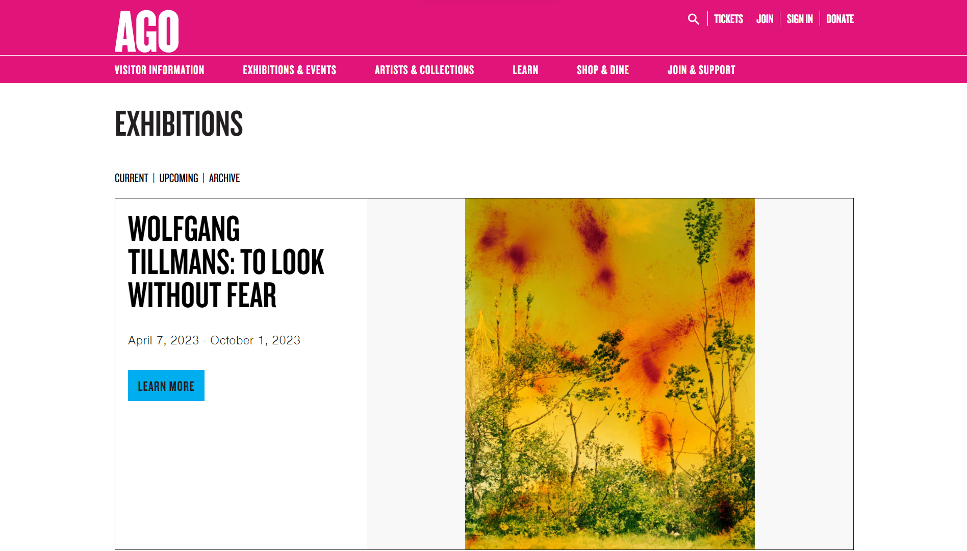
Exhibitions & Collections Page
For the exhibitions and collections pages, I chose to keep the grid look because it was clean and simple and rearrange it according to what users would like to see first (the variety of them). Plus, the usage of the grids automatically allowed me to display their images right at the front when a user lands on the page. I also used some features from the existing site because they are ok in terms of usability and they suit the new look too, the save time I did not protype them again.
I also highlighted simple reminders to the user such as “Visit us today”, and others like newsletter signups and most importantly the FAQ page because that was on page that was quite buried in the original site, and I believe I did not add it in the site map due to the immense quantity of pages available on the site, but regardless I wanted to bring it out to the front. Another detail would be the consistency of the header design across pages that made the website more familiar to the user.
Conclusion
To summarize, my prototype has the most significant change in design, and thus usability, compared to content and hierarchy. Being a museum’s site, there is an expected overload of information due to the nature of the organization. But my focus was on simplifying the pages visually and redesigning to make the website suit the actual museum’s image.