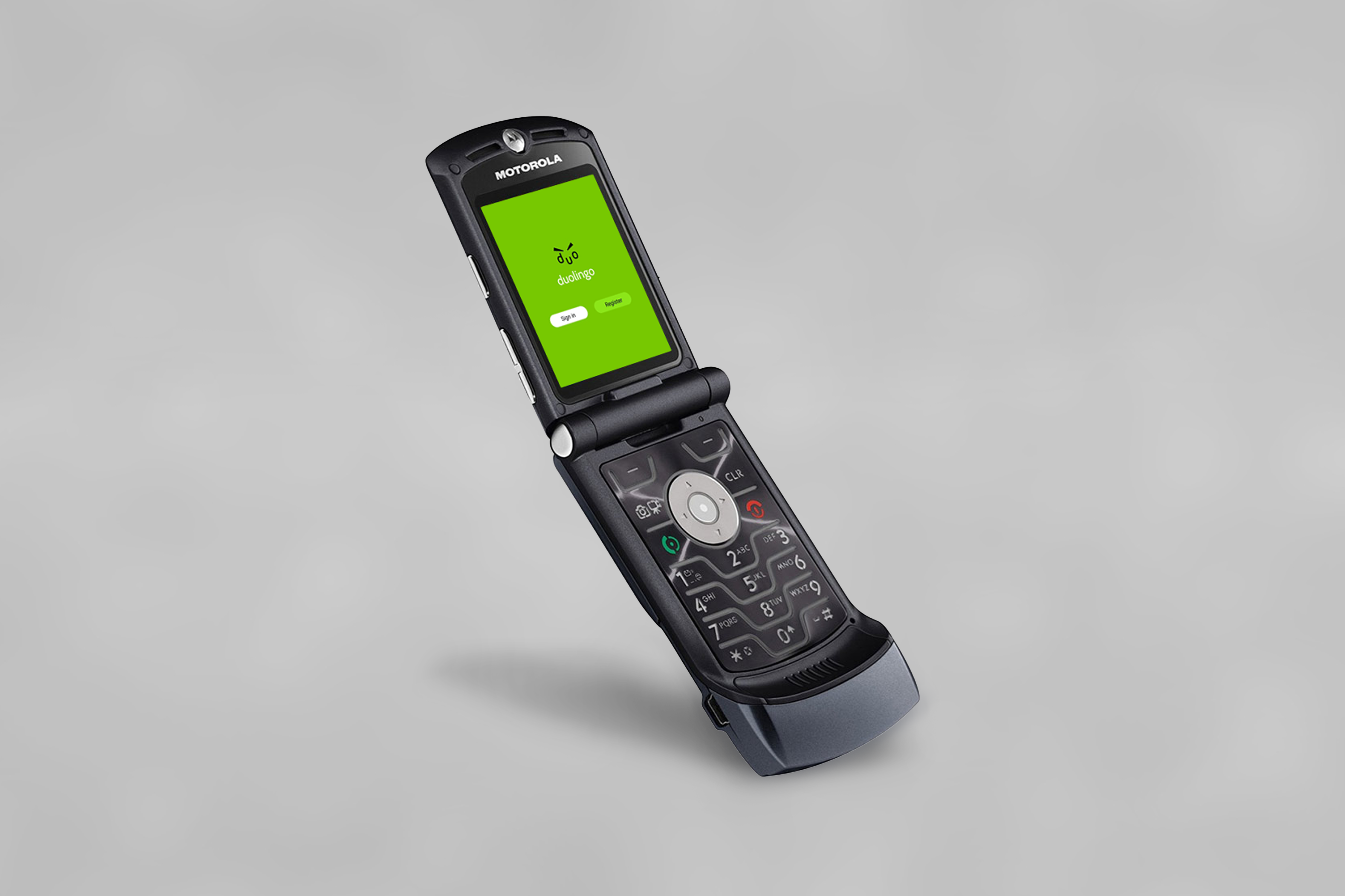
I decided to design Duolingo (founded 2011) on Motorola Razr V3 (2004 model). In the home screen, I want to show how the app looked on Motorola because app logos used to be much simpler before, but we are so used to seeing detailed illustrations as app icons now that we don’t realize how much UI and design has changed over the years. I went back to one of Duolingo’s earliest logos and drew the simpler icon based on it. One thing I had to keep in mind was how phone navigation worked before touchscreens became the norm. Using the top left and right buttons for the options that alter depending on the screen and the central navigator and selector, I designed the user flow of doing a daily challenge in Duolingo.
Duolingo Logo (2011-2012)
Duolingo Logo Redesign
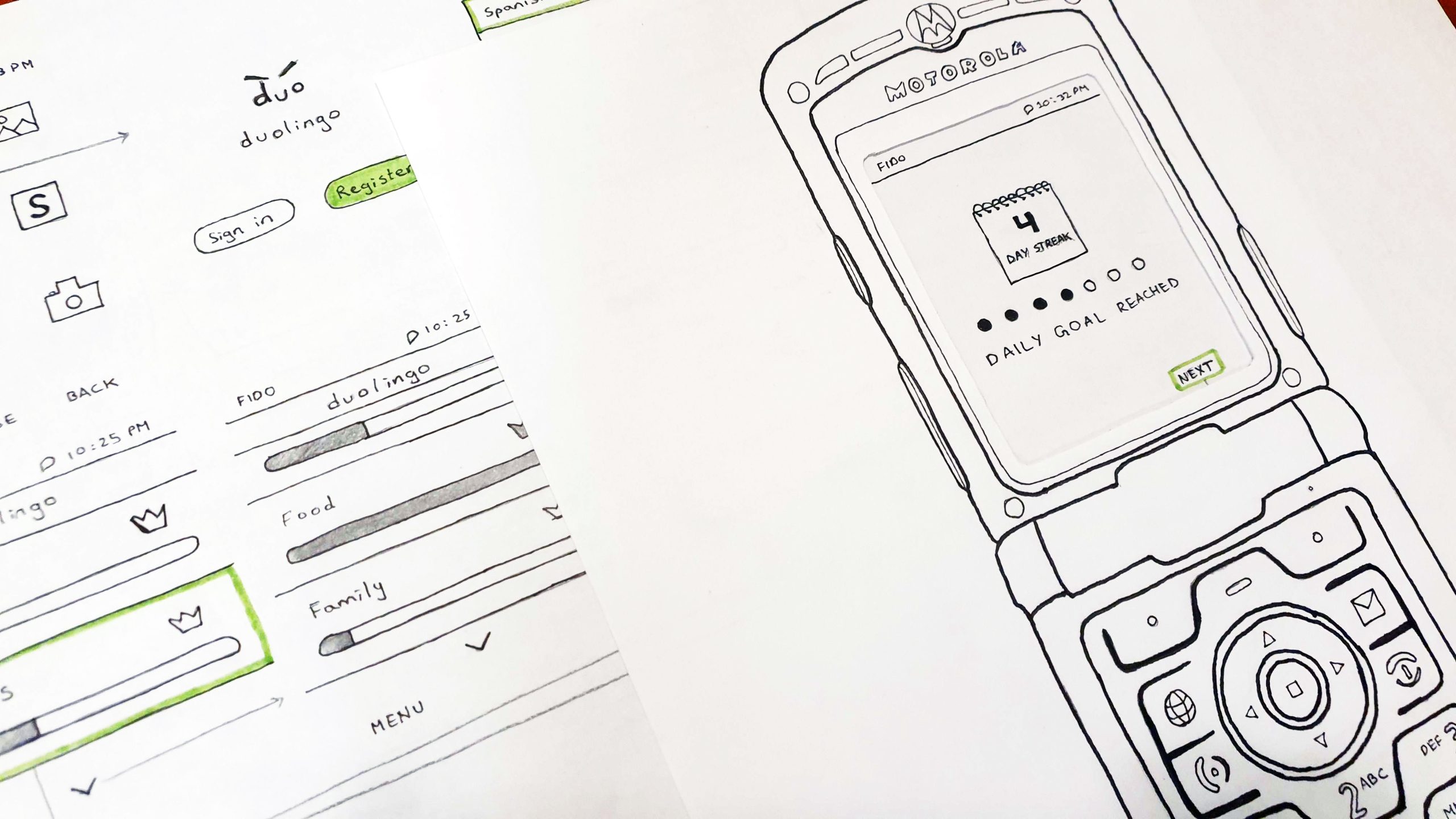
Paper Prototype
Splash and Home Screen
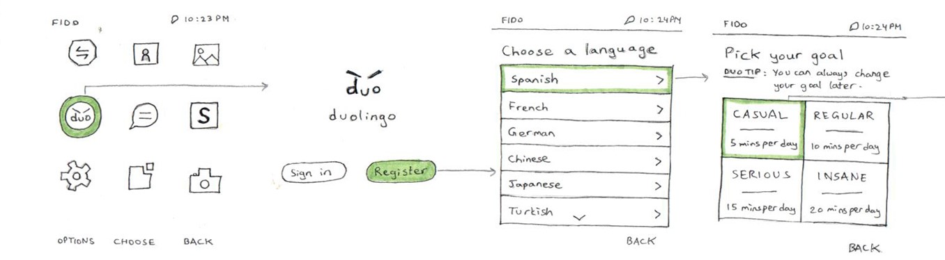
The first screen that comes up may look very similar to ones we have in smart phones now, but I didn’t want to antiquate the look of the phone too much keeping in mind that it’s a 2004 model and not a 90’s models. I purposefully kept some images because digital screens had developed quite a lot compared to the screen used in Nokia 3310 (2000 model) for example. Guiding the user through the login screen, the user sets their target language and practice goal. In these two interfaces, the design isn’t much different than it is on smartphones, but the biggest change was to utilize the central navigation and selection rather than just tap on the screen. These physical motions also called for a visible panel (highlighted green in prototype) indicating current cursor placement.
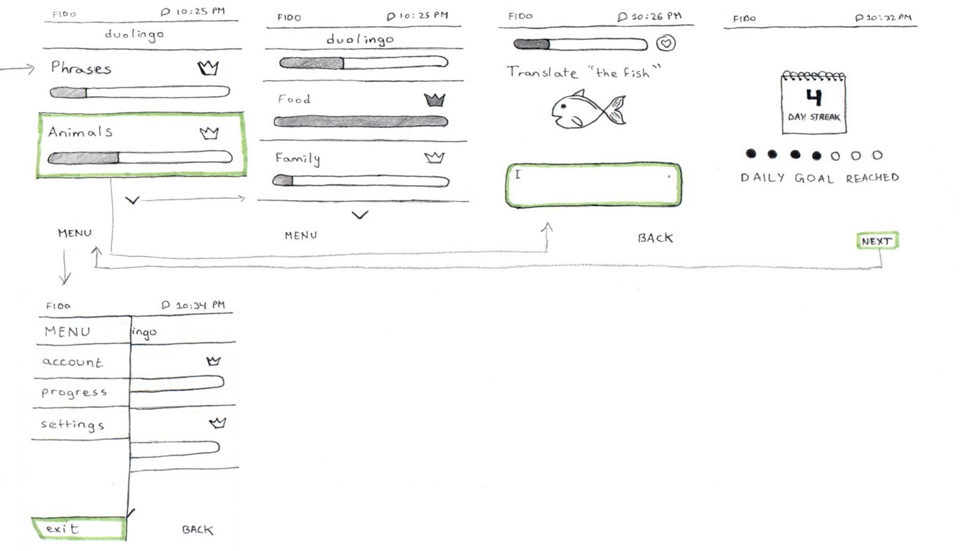
For the home page of the app, I opted for a singular stack of chapters (e.g., Phrases, Animals, etc.) opposed to the icon and symbol-based approach Duolingo has in smartphones right now. To minimize load time, increase efficiency, and allow the app to function on 2G. Stacking allows the user to see their progress through a linear progress bar (which is currently a circular progress indicator in smartphones) plus use the up and down navigation buttons to view other chapters. In 2004, gamification was not fully explored yet, but I wanted to maintain that aspect of Duolingo by keeping the crown, indicating completion of a chapter, and the day streaks of successfully meeting the user’s intended goals.
Daily Goal Flow
During the challenge itself, a picture and text appear. The cursor is blinking on the text area waiting for user input from the physical keyboard. Once the final question is submitted, the user’s current streaks appear, showing progress and further motivating the user to keep going strong. The user is then returned to the home page from where they click the top left button leading to the small menu panel. I added this menu panel because older phones do not have sufficient space to give a fully featured nav bar and footer where their account setting, and other options are displayed. Thus, I thought of turning the sandwich menu into a side panel and allowing the user to navigate to their account, settings, progress, and exit the app and land back on the phone’s home page since almost all older apps, such as the bouncy ball game, had that as a consistent feature.
Conclusion
Most of these decisions were made based on my own experience and the research I did through Motorola Razr V3’s User Guide that I found online to figure out the buttons’ functions. The login and/or registration process was purposefully excluded to focus on the task of completing a daily challenge on the app. Looking back now, I believe some design choices can be improved, such as the MENU sidebar which should have been full screen instead of half screen (which is more commonly seen in smartphones). I hope to do more research on older interfaces and try another iteration of this project. Below is the Walkthrough of the paper prototype.