EcoCraft
Conceptual
Team School Project
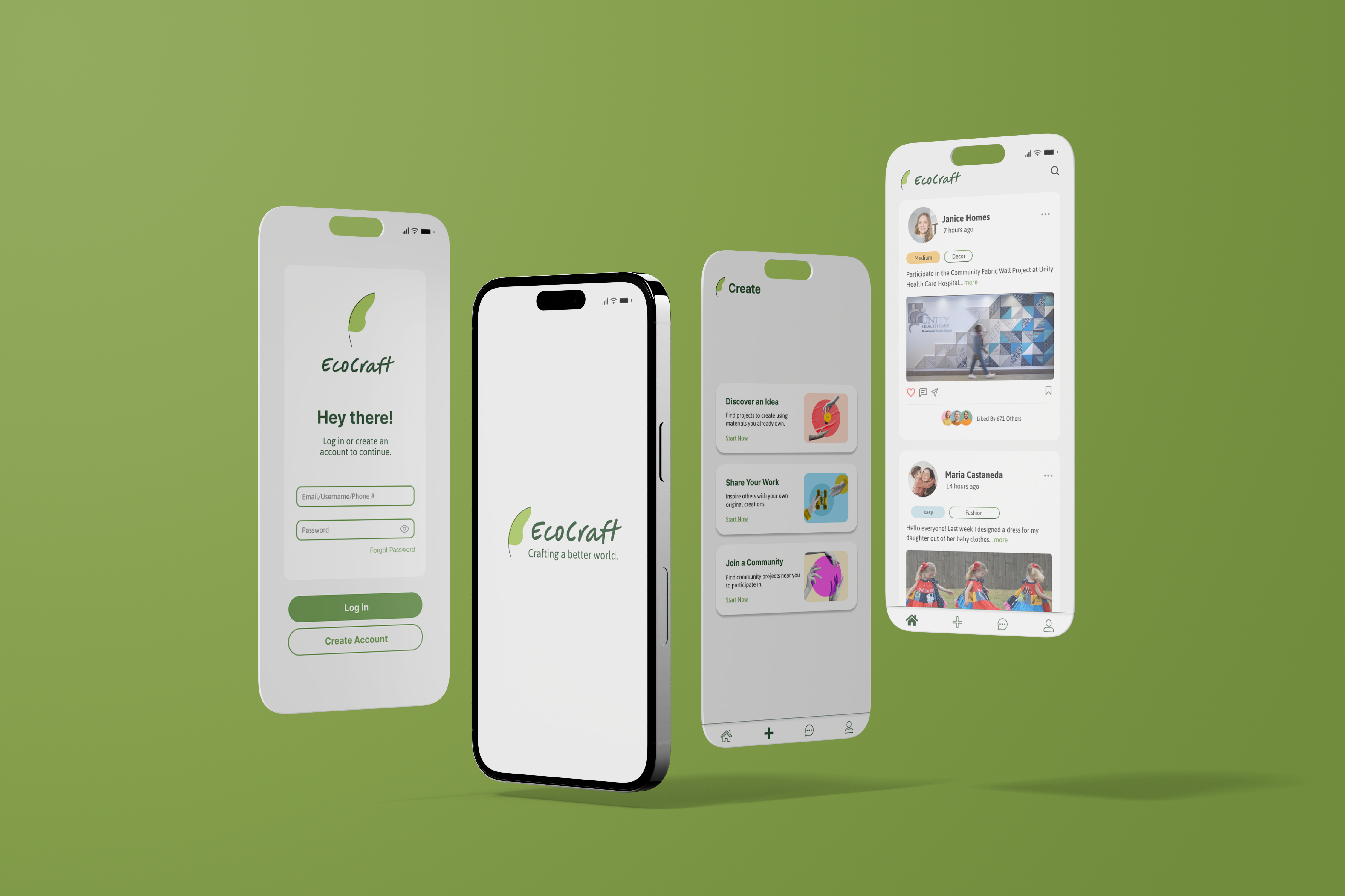
A fun & educational app to promote upcycling your belongings
The prompt was to design a mobile application that not only creates a positive and measurable ethical, equitable, or environmental impact but also provides a seamless and intuitive user experience. Based on this, our team decided to choose the topic of sustainable crafting after a round of rapid ideation.
Roles
UX Researcher & UI/UX Designer
Timeline
Nov 2023
4 weeks
Tools
Figma
Team of 5
(overlapping roles)
5 UX Researchers
3 UI/UX Designers
Problem
Solution
EcoCraft is a mobile app that lets you upcycle belongings that people no longer need through crafting, turning one man’s trash into the same man’s treasure!
Why would EcoCraft work?
► The green tech market is projected to grow for the next 7 years.
How do you know it’s EcoCraft?
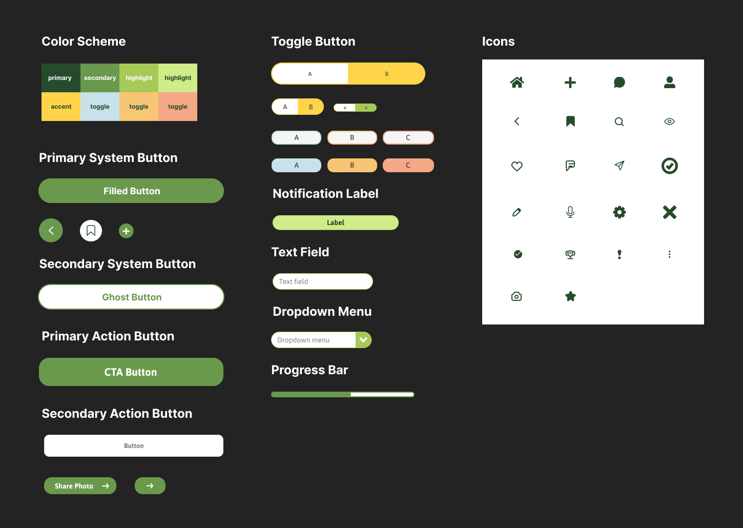
Before designing the interface we branded EcoCraft so that it would be easily recognizable to its users. We stuck to a simple green and off white colorway to allow users to correlate EcoCraft with sustainability and a font type that is easy to read as they interact with the app.
Design Process
► Create Personas: for testing and refining the app
► Identify Users: Eco-conscious individuals and people who want to craft/crafting enthusiasts
► Analyze Findings: make connections between features, user expectations, and new changes to make
Wireframe
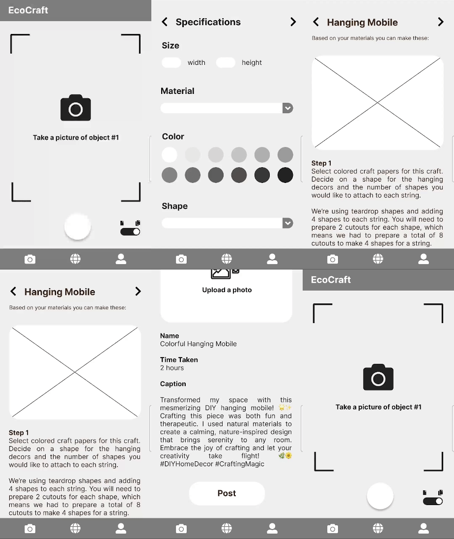
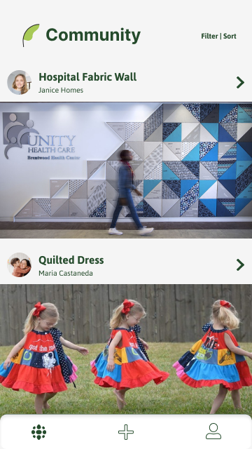
Preliminary design for the app to pitch the idea: EcoCraft is intended to be used as a tool and outlet for eco-conscious individuals, and crafting enthusiasts. This is a community-driven platform where users are able to share their creations and connect with each other. EcoCraft acts as a hub for learning and innovation.
First Iteration
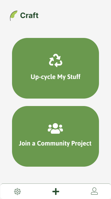
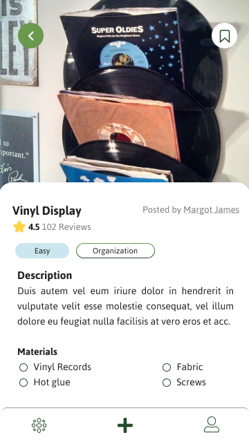
Based on wireframes, background research, and user personas.
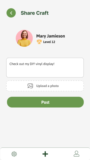
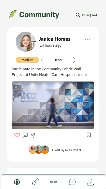
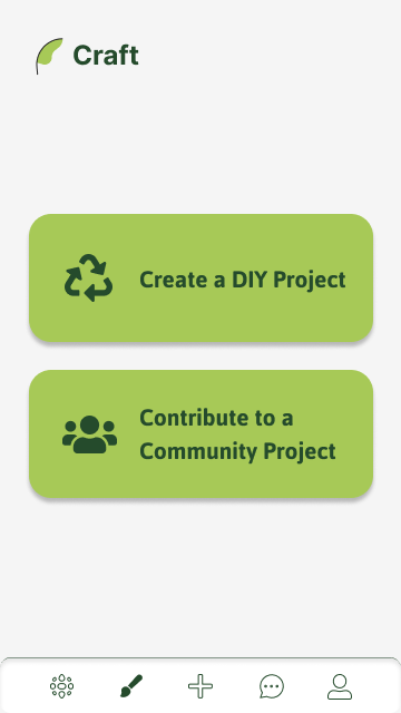
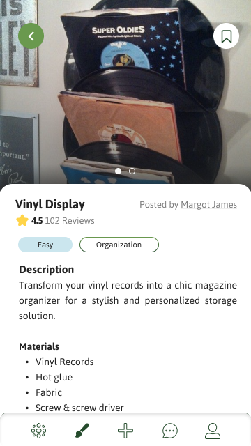
Second Iteration
Changes from previous iteration:
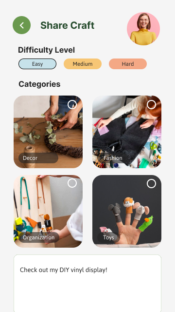
- Redesigned the dock to add a messaging feature for socializing and a paintbrush to generate new craft ideas instead of the plus sign which only composes a new post.
- Added instructions to the top of the screen so user’s know what is being asked of them to complete.
- Allowed users to input multiple images and videos, instead of one, to show how to complete the task for visual learners.
- Implemented a progress bar on the specifications page to visually showcase which step the user is on before the system generates ideas.
- We customized the experience for younger audiences upon signing up by asking their age to tailor the content to their appropriate level and simplify the user flow and pages to their needs.
- Added searching feature with an easily recognizable “magnifying glass” icon to help lead them directly to the results they may be looking for.
- Allowed users to select difficulty levels of the projects they are prompted with.
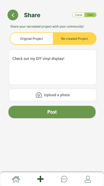
- Created an option to post within friends or publicly.
- Included an information icon at the top right corner of the first page to give users the chance to skim through app details if needed.

Final Iteration
Changes from previous iteration:
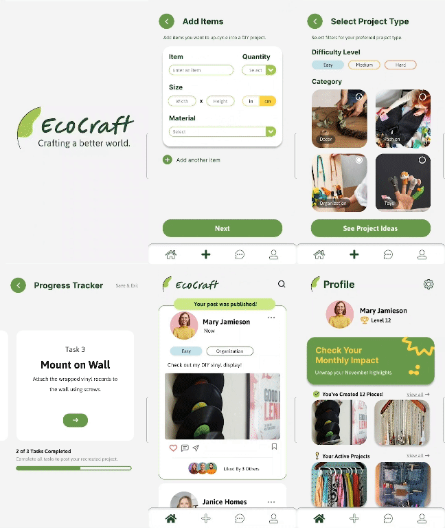
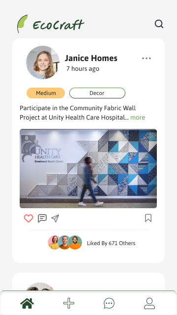
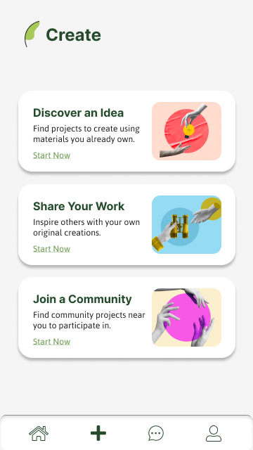
- Limited elements in the dock to 4, changed the globe to a home icon to prevent confusion between the community and the “For You” page, and decided to provide 3 prompts when users first click the plus sign, which leads them to 3 options, discover an idea, share a post, and join a community.
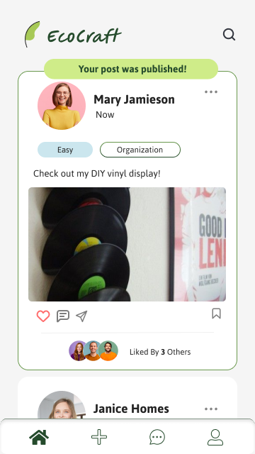
- Highlighted when a post was successfully published using a pop-up and green outline around the user’s post.
- Allows users to expand on users’ shared recreated crafts to view who the original creator of the craft and click on their tutorial to recreate the project.
- Implemented a tracking feature between the process of opening project instructions and sharing a post to allow users to track their design progress.
- Added a progress bar to the tracking page to show how many steps are remaining before they have successfully completed the project.
- Removed the progress bar from the specifications page to allow users to automatically exit to the page they were at previously instead of having to go to the navigation bar.
- Included an exit button at the top right corner of the screen in the Monthly Wrapped.
- Allowed users to view their carbon footprint after every project was completed as well as in their monthly recap.
- Changed the title to be more specific to the page such as changing the “specifications” title from all screens to “add items” and “select project type” to make it more specific.
- Created a feature that allows users to differentiate between a “share original” and “share recreated craft” post page.
Lessons Learned
► Realized the value of having a diverse and accurate sample of users during testing phases to make sure that the feedback and data reflected the whole user base.
► Recognized the importance of gathering quantitative data before and after users interact with the app. This allows us to make direct comparisons and monitor progress.
► Testing with as many possible partners has a lot of advantages. Different unique views can provide us with practical ideas that help improve app functionality and user satisfaction.
Future Iterations
Based on the valuable insights gained from recent user testing, EcoCraft’s future iterations aim to enhance user experience and foster a more dynamic community.
► To address users lacking specific items for project ideas, a feature allowing them to generate random ideas will be introduced, encouraging creativity without constraints.
► The update the design of the navigation bar to align with the overall app aesthetics.
► Expanding on the messaging aspect, enabling users to send friend requests and exchange messages with like-minded individuals, fostering a sense of community.
► To offer greater convenience, the login options will include well-known platforms like Google and Facebook, allowing users to link their accounts on other social media platforms to create more awareness.
► Implementing a feature that allows users to set monthly goals with daily personalized quotes to motivate them.
Conclusion
Overall, EcoCraft’s research process revealed important insights into user behavior and preferences. The prototype examines user pain points, leading to a more sustainable approach to crafting that is also creative. However, during the research and testing phases, we faced challenges with intuitive navigation and clear instructions. Future iterations would need to focus on improving usability for different user demographics as well as making the app easier to use for younger audiences. Ultimately, maintaining our focus on community participation will improve user experience and increase the app’s influence.